

The Situation
Award Magic offers premiere awards travel planning service for booking flights with credit card points and airlines rewards. The existing website suffered from weak SEO performance, limiting organic traffic and potential customer acquisition. Additionally, the site was developed without UX design principles, likely creating friction points in the user journey.
As a bonus challenge, a lack of existing analytics or marketing data offered limited insights into user behavior and constrained the overall strategy, necessitating a comprehensive discovery phase to inform data-driven decisions.
Business Goals
Project Objectives
Discovery
The discovery phase was critical in laying the groundwork that guided the redesign. By conducting user interviews, competitive and market analysis, SEO research, and a thorough site audit, I identified key SEO phrases, opportunities for strategic improvements, and uncovered insights that reshaped the challenge.
Competitive & Market Analysis
Key findings
Competitor Chart

Site Audit and User Interviews
Key findings
Perspective Development
Usability tests asking users to start and complete a booking allowed us to quantify the task difficulty.
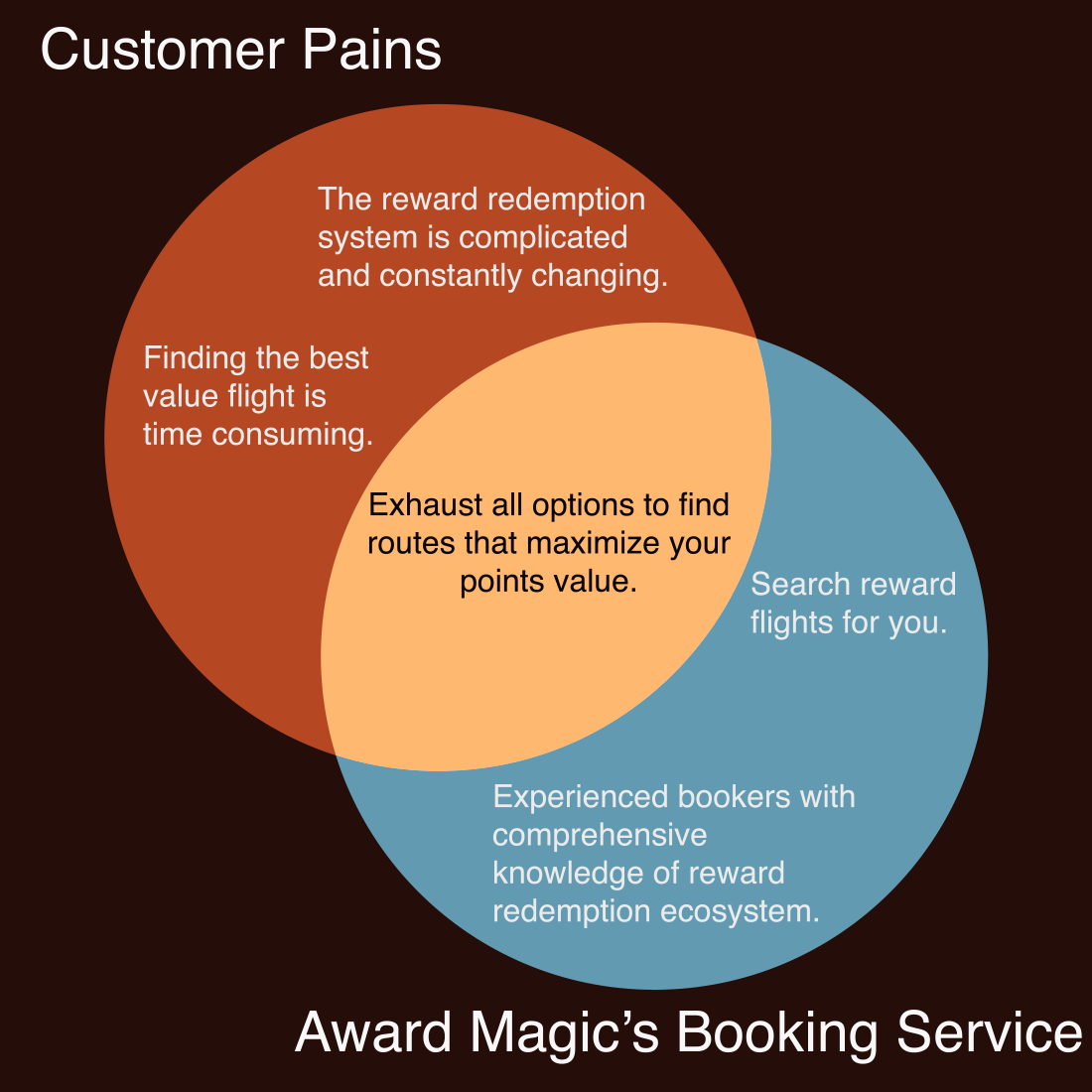
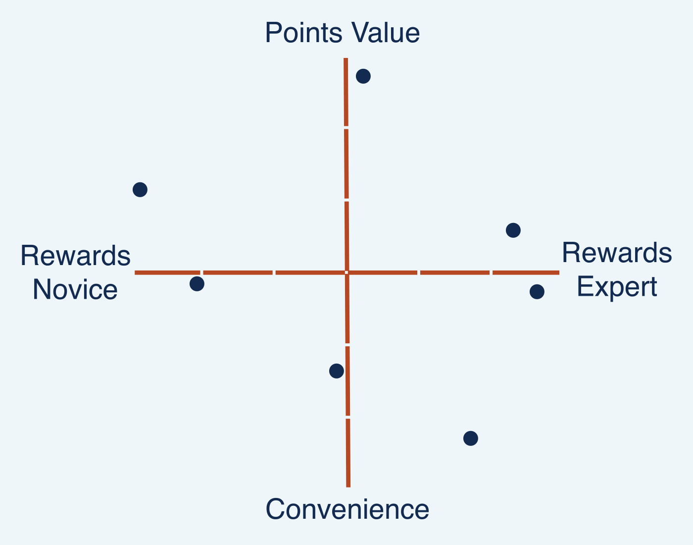
We used information from the user interviews as well as what customer data we had to mockup personas. While the personas will go on to inform our marketing strategy, developing them highlighted two major variables and revealed a common challenge our users face, offering direction for the redesign.
Insights from usability tests + user feedback
Graphing feedback from customers who booked with Award Magic

Take aways
Reframing the UX Challenge
Our insights taught us that users new to reward travel or at earlier stages in the customer lifecycle struggle to gain value, underscoring the need for a more accessible and informative user experience. At the same time, we wanted to provide a streamlined experience for users affiliated with Award Magic or with advanced reward travel knowledge.
Additionally, customers expressed delight regarding their experience working with Award Magic itself and a preference for Award Magic over a credit card reward travel portals or other reward booking services.
How might we provide an accessible and informative user experience without detracting from the streamlined experience repeat customers enjoy.
Evolved Design Objectives
Design Guidelines
Design Results
With the aim of enhancing user navigation, streamline information access and search engine optimization, the redesign strategically reconstructed the website’s navigation and content structure, developed new interfaces for key pages, and created a new informational introduction page that doubles as a pillar page for future content expansion. The reworked pages include: home page, booking page, services page, and the ANA ticket booking page.
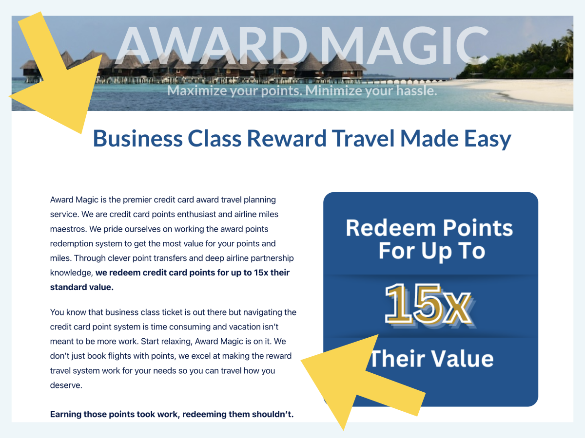
Home
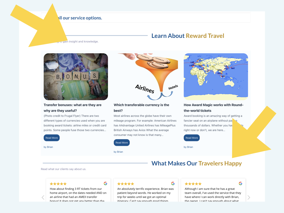
We completely redesigned the homepage to include new Headers and copy to reflect the user journey, communicate Award Magic’s value proposition and boost SEO. We also added a carousel to draw the eye directly to easily digested value propositions.
We added two CTA buttons giving users the option of easy access to Award Magic’s primary booking service or learn more about reward bookings. And we added Award Magic’s most popular blog posts and Google reviews for added search authority and best practices.
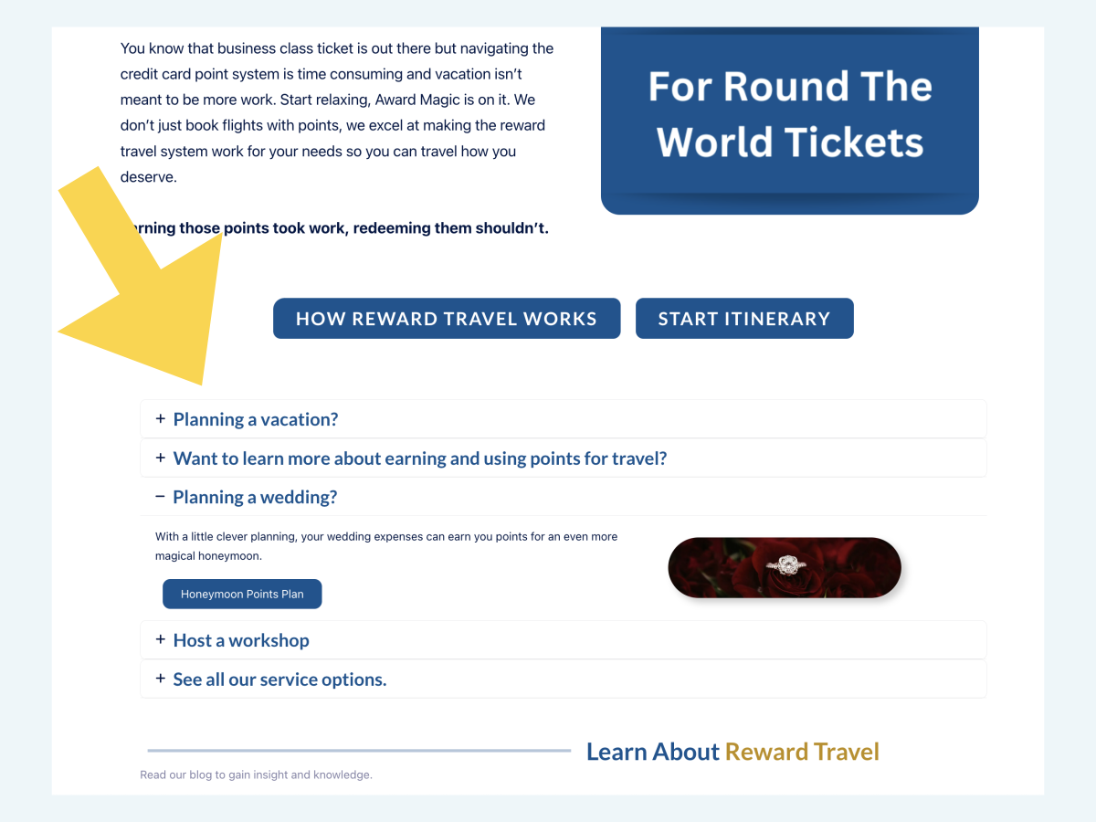


Start Itinerary
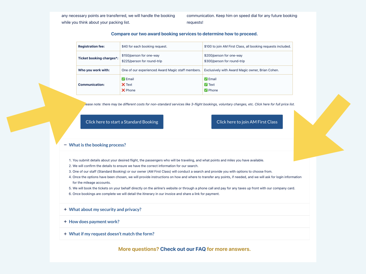
Award Magic’s primary service is reward flight booking. They have two tiers of service and the tiers existed on different pages. Analysis of research and feedback led us to redesigning these service pages to live on a single page, make comparing them simple and write copy that speaks to customer needs and our solution. We also added an FAQ section directly pertaining to the booking process for the unaffiliated customer.
Services Overview
The Services Overview page was redesigned so the description of each service spoke to the customer journey and communicate Award Magic’s Unique Selling Proposition for each service. The layout was improved for clarity and flow, and the UVP for each service.
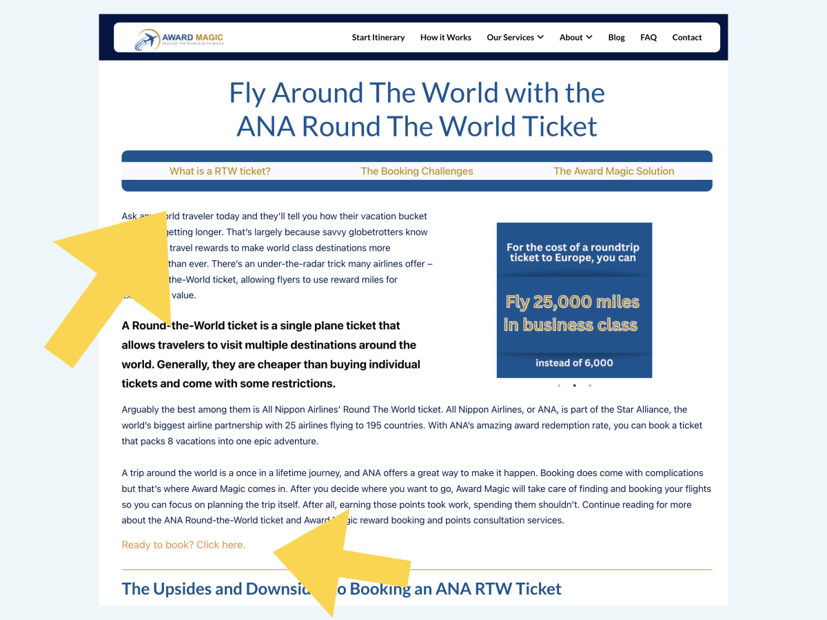
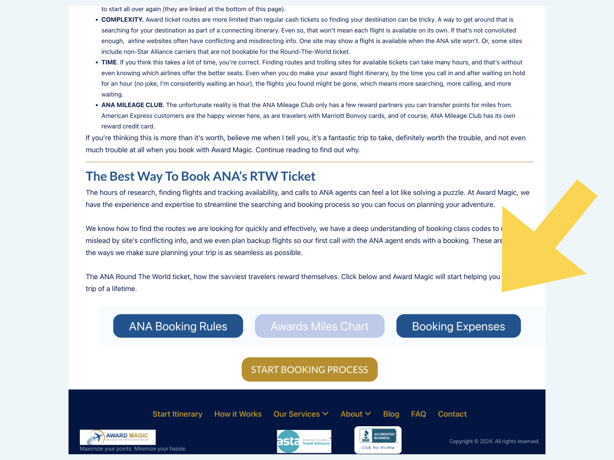
Round-the-World Tickets
This page was redesigned so it would function as both an itinerary booking page and an informational page. The design incorporated a lot of market, SEO and UX analysis. The copy was written to speak to the customer journey of booking ANA round-the-world tickets. The layout was designed with both advanced and unaffiliated users in mind.
We added navigation so users can quickly jump around the page or immediately start booking, a carousel for the most important value considerations, and informational lightboxes useful for customers with any level of reward travel knowledge.
How It Works
This page was a new informational page created for the site redesign. It’s primary function is to enhance Awardmagic.com’s authoritativeness for SEO, as well as provide users with limited reward travel knowledge or users in the early stages of the customer journey all the information they need to know. The copy and layout were designed to tee up Award Magic’s key differentiators.


SEO
We followed EEAT protocols for site structure pages to improve SERP rankings such as blog content authorship and expanded bios, or various backend fixes.
We developed and launched a paid ad campaign pushing the Round-the-World ticket booking service. The campaign was also designed to test the resonance of some SEO phrases for future iterations.